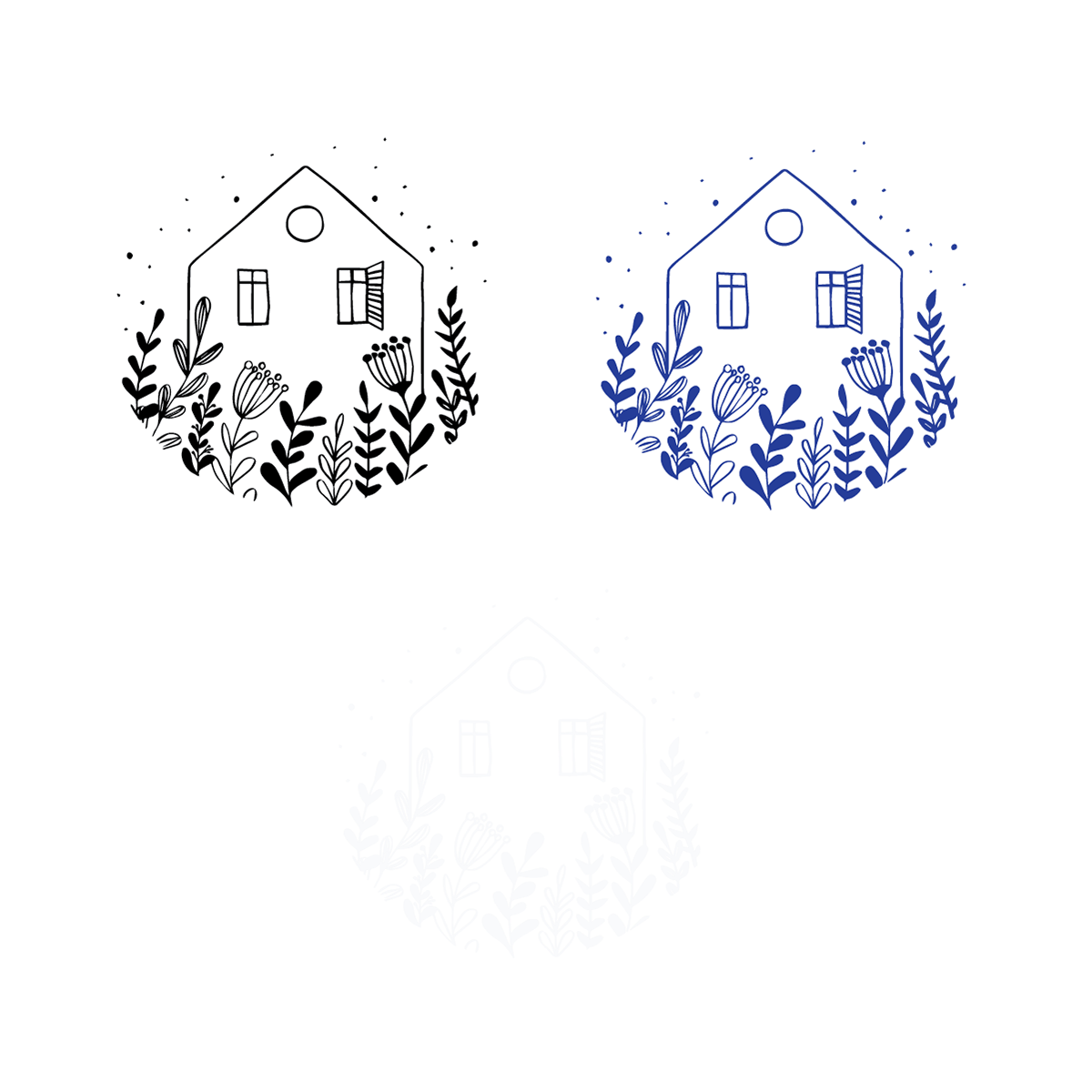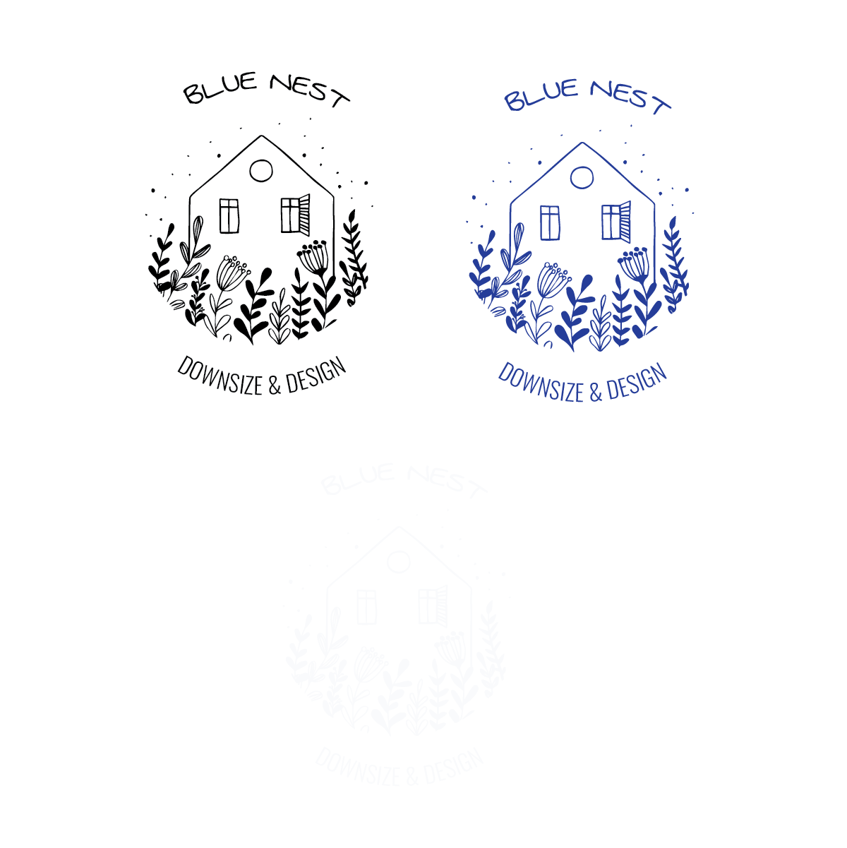
I was asked by a close friend to create the branding of a home staging and design company. Elements that meant a lot to the client were forget-me-not flowers and the sense of home. The company was to be based mostly in rural and suburban areas focusing on families, single moms, and people heading into retirement. With all of this information and some brainstorming with the client I was able to find a name and logo design that spoke to her needs as well as fonts and colours that stayed true to the warm inviting energy she portrays while also staying modern and clean.